We are happy to share our biggest updates, new features and improvements on Hashnode’s mobile apps.
Ready to explore what’s new?! 🔥
Fresh design
We have made the UI much more clean and consistent. You're going to love the new experience.

Dark mode
Dark Mode has been the most requested feature by the Hashnode Community, and it's finally here! 🌓

You can enable it on the sidebar, or you can go to
Settings
-\> Appearance
.
New sidebar
We updated the sidebar design to provide a better experience, especially with the addition of the dark mode.

New blogs home screen
We are shipping some slick animations to the blog screen. 😎
The blog header will smoothly scroll out to give you more space to explore the article.
Here's how it used to look:

And here it’s after scrolling:

Faster article screen
Looks and feel are not the only things that have changed. We rebuilt the whole article page from the ground up to deliver a native experience.
Particularly:
- We have replaced WebViews with the native components. This helps us in delivering a much faster and decluttered experience.
- Now you can read your favorite articles, distraction-free, with a native feel on both iOS and Android.
- The articles are now cached, meaning they will open immediately if you visit them again.
- The article screen respects your theme preference set on the app (or your phone) and renders the screen in light or dark mode. It's consistent with the overall experience of the app.

Table of Contents
We also added the Table of Contents. It’s visible at the top of the article, and you can access it with just one click.
You can now navigate to any part of the article via the Table of Contents.

Reaction bottom sheet
When we talk about delivering native experience, we mean it!
We are excited to introduce the reaction bottom sheet for adding reactions. It's just a click away, so feel free to shower love on your fellow bloggers without hassle. 👍🏆🦄👏❤

Who reacted to my article?
Aren’t you curious to know who is supporting your blogs by adding reactions?!
Well, you don't have to be anymore! Simply long press on the reaction icon and it will open the "Reactions" bottom bar listing all the reactions.
This feature is available for articles, comments, and replies as well.

Comment screen
We wanted to offer you a clean and distracting-free environment, to achieve that we removed the comments and transferred them to a new, dedicated screen!
Simply press on the comment icon to load all the comments and replies to the article.

Adding comments is much easier now. We are adding a full-screen editor just for adding comments. This will give you enough space to write your feedback in detail. You can also mention users to notify them.

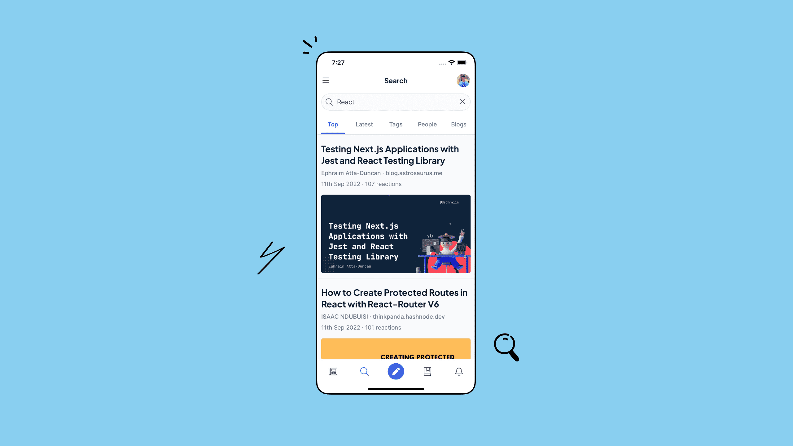
Blog search
The search bar now supports searching for blogs too! 🔍
You can search for your favorite ones instantly.
Overall, we have improved the internals of the app, and it's much faster now. We have also added subtle animations to enhance the user experience! We hope you’re enjoying it as much as we do.
The app has undergone the biggest update yet! We would love to hear your feedback. 💙
#
Bug Fixes ~ Website
🐛
- When a user deletes a publication, the drafts are now moved to the user’s personal blog.
- An error modal used to appear in “Schedule your article”, now this has been fixed. The default schedule date is applied properly on the initial “Select a Date” click. If the author wants to schedule for the default date, it doesn't require a manual date selection.